A CSS alapjaival foglalkozó sorozat jelenlegi részében a CSS segítségével megvalósítható hátterekkel foglalkozunk. Háttere szinte minden DOM entitásnak lehet, de talán legtöbbször a
body illetve a
div elemekhez szoktunk hátteret beállítani. A beállításhoz a CSS
background tulajdonságának különböző variációira lesz szükségünk.
A
background-color segítségével beállíthatjuk a háttér színét. Ez főleg akkor hasznos, ha nem valamilyen képet akarunk beállítani háttérként vagy fennáll annak a lehetősége, hogy a háttérként beállítani kívánt kép mérete nem éri el a teljes kitöltendő területet, és a kép által nem takart rész színét mi akarjuk meghatározni. A legfontosabb az, hogy mindig ügyeljünk a háttér és a tartalom kontrasztjára, mert a fekete alapon sötétszürke betűk — és még rengeteg további példát sorolhatnék — olvasása rendkívül fárasztó, így látogatóink otthagyják az oldalt akármennyire érdekes is a tartalom. A következő beállítással például feketére állíthatjuk az egész oldal hátterét:
2 | background-color: black; |
A
background-image tulajdonság beállításával egy képet használhatunk háttérként. Mivel háttérképről van szó, ezért célszerű olyan képet választani, amely nem vonja el a figyelmet a tartalomról. Ehhez általában az kell, hogy a kép ne legyen nagyon harsány, lehetőleg legyen homogén és elegendő kontraszt maradjon közte és a tartalom között. A következő példa egy szakasz háttérképét állítja be:
2 | background-image: url(background.jpg); |
A
background-repeat segítségével adhatjuk meg, hogy a
background-image-ként beállított háttérkép ismétlődjön-e vagy sem. A
repeat, a
repeat-x, a
repeat-y és a
no-repeat beállítások közül választhatunk. A
repeat megadásával a képet – ha az kisebb, mint az elem, aminek a hátterének beállítottuk – mind függőlegesen, mind vízszintesen ismétli úgy, hogy az elemet teljesen lefedje. A
no-repeat ennek pontosan az ellenkezője: nem ismétli meg a képet, akkor sem, ha így az elem valamekkora része háttérkép nélkül marad. Ilyenkor a képpel nem fedett rész a
background-color tulajdonság által megadott színű, vagy ennek hiányában alapértelmezett színű (általában fehér). A
repeat-x csak vízszintesen, a
repeat-y pedig csak függőlegesen ismétli a beállított háttérképet. A következő beállítás nem ismétli a háttérképet:
2 | background-repeat: no-repeat; |
Háttérképünknek nem kötelező az alapértelmezés szerinti középen lennie. A
background-position beállításával megadhatjuk, hogy a háttérkép hova kerüljön. A beállításnál a
top,
bottom,
center,
left és
right lehetőségeken kívül pontos értéket vagy százalékot is megadhatunk. A következő példa a háttérképet balra, és az elem tetejéhez képest 10 pixellel lejjebb igazítja:
2 | background-position: left 10px; |
A végére hagytam a legérdekesebbet, a
background-attachment tulajdonságot. Két beállítási lehetősége van: a
scroll és a
fixed. Ha a
scroll van beállítva – ez az alapértelmezett -, akkor az elem görgetésével annak háttere is vele együtt mozog. A
fixed beállítás esetén viszont a háttér helyben marad, és görgetéskor csak a tartalom mozog. A fixed beállítás ízléses alkalmazása sokszor feldobja az oldal összhatását. A következő példa rögzíti az oldal hátterét:
2 | background-attachment: fixed; |
Ha szeretünk rövidíteni, használjuk a
background tulajdonságot, amely lehetőséget ad a fentiek egyszerre való beállítására. A sorrend ilyenkor a következő kell legyen:
background-color,
background-image,
background-repeat,
background-attachment,
background position. Például:
2 | background: black url(background.jpg) no-repeat fixed left 10px; |
A fent bemutatott background-tulajdonságok minden elterjedt böngésző esetében használhatóak.
másik cikk
|
| Lately I’ve had a lot of requests from clients for photo galleries. I decided I needed to see what css options I could come up with to keep my galleries interesting which would allow each site to look unique. Here are a few examples that I came up with.
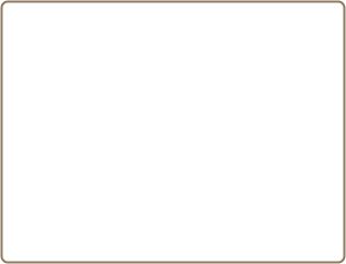
Simply StatedThis is possibly the simplest border but one that is high on style. This one pixel solid border has 5 pixels of padding and a background color.
The CSS:
1 2 3 4 5 6 | .plain {
border: 1px solid #4C3C1B;
padding: 5px;
width: 300px;
background-color: #EFEECB;
}
|
SnapshotIf you wanted all of your images to look like Polaroid pictures, you could use this easy technique. By increasing the padding-bottom you get that “polaroid” look.
The CSS:
1 2 3 4 | .snapshot {
border: 1px solid #666666;
padding: 10px 10px 60px 10px;
}
|
Art GalleryThis technique gives each one of your images the appearance of being framed and placed in an art gallery.
The CSS:
1 2 3 4 5 | .art {
border-style: double;
padding: 16px;
background-color: #DCDCED;
}
|
Above and BelowPlace a double border above and below your photo for a cool look!
The CSS:
1 2 3 4 5 6 7 8 9 | .ridge {
border-top-width: 4px;
border-bottom-width: 4px;
border-top-style: double;
border-bottom-style: double;
border-top-color: #E1A60A;
border-bottom-color: #E1A60A;
padding: 8px 0px;
}
|
HeartsThis isn’t supported in all browsers but it’s still fun! Using the border-style: dotted; and playing with the width of the image, you can get four hearts in each corner!
The CSS:
1 2 3 4 5 | .hearts {
border: 10px dotted #29C3FF;
margin: 0;
padding: 0;
}
|
Patterned BackgroundYour options using a patterned background are limitless. This example also used a 1px border around the patterned background for a little more detailing.
The CSS:
1 2 3 4 5 | .pattern {
padding: 11px;
background-image: url(squares.jpg);
border: 1px solid #E95683;
}
|
Shadow with ImageThis is a similar technique as the one above using a background image. Instead of using a patterned background, I made a graphic of a shadow. To use this technique you have to know the size of your photo, create a rectangle a few pixels larger than your photo. In this example the photo is 300px wide by 199 pixels in height, I’ve created a rectangle that is 319px wide by 218 px in height. Soften the edges with your graphics software and save.
Here is the shadow image:

Add this to a div as a background and you get a pretty nice effect!
The CSS:
1 2 3 4 | .shadow {
background-image: url(shadow.jpg);
padding: 9px;
}
|
Off BalanceThis example has a heavier border on the right and bottom plus a background color.
The CSS:
01 02 03 04 05 06 07 08 09 10 11 | .right {
width: 300px;
padding: 0px 6px 6px 0px;
background-color: #9FB2C1;
border-top-width: 2px;
border-right-width: 5px;
border-bottom-width: 5px;
border-left-width: 2px;
border-style: solid;
border-color: #082F70;
}
|
GrungeThis example has a mask applied to a rectangle that I made in a graphics program.
Using the rectangle as a background image in the div creates a pretty interesting effect.
Here is the rectangle with the mask applied.
Here is the finished gallery example:

The CSS:
1 2 3 4 5 | .grunge {
background-image: url(laptop-graphic.jpg);
padding: 26px 23px;
width: 223px;
}
|
Rounded CornersThere are several ways to do this example, but I will show you my favorite!
First start with a rounded corner graphic that you create in your graphics program.
Your next step is to slice it into three images.
Top

Center

Bottom

This method takes three divs. The html will look like this:
1 2 3 4 5 | <div class="roundtop"></div>
<div class="roundside">Place Your Image Here </div>
<div class="roundbottom"></div>
|
The center div which I called “roundside” which holds the image will have “repeat-y” added.
Here is the completed result as well as css.
The CSS:
01 02 03 04 05 06 07 08 09 10 11 12 13 14 15 16 | .roundtop {
background-image: url(rounded-top.jpg);
width: 315px;
height: 10px;
}
.roundside {
background-image: url(rounded-sides.jpg);
background-repeat: repeat-y;
width: 315px;
text-align: center;
}
.roundbottom {
background-image: url(rounded-bottom.jpg);
width: 315px;
height: 10px;
}
|
|
|
Nincsenek megjegyzések:
Megjegyzés küldése